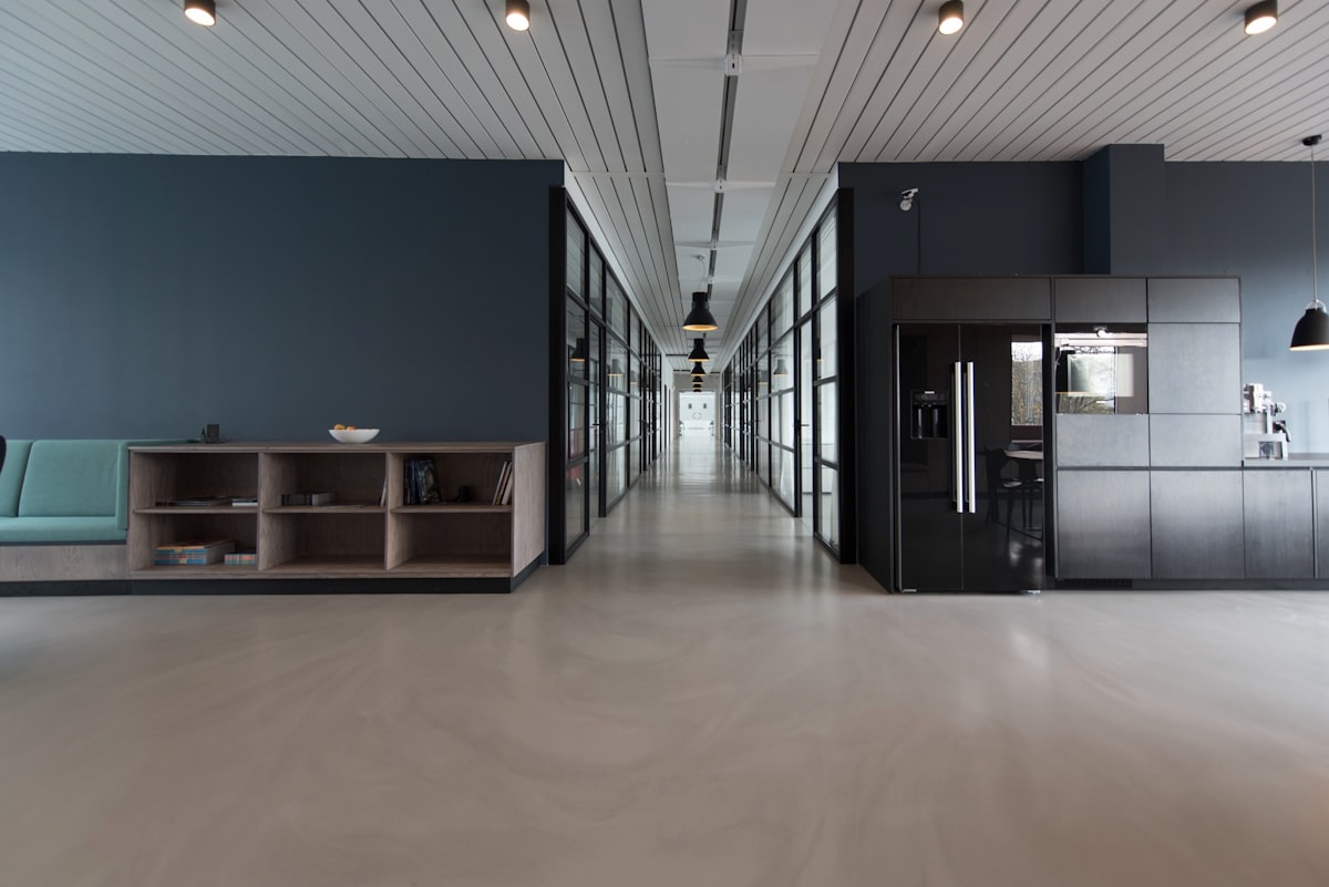
In the modern digital landscape, empty space is often treated as a void to be filled rather than a structural element to be respected. We construct interfaces with infinite scrolling, dense data tables, and relentless notifications, leaving no room for the eye to rest or the mind to breathe.
But true editorial design understands that silence is just as important as sound. The negative space around a block of text does not represent a lack of content; it acts as a frame, elevating the words within it. It commands attention through restraint.
Consider the architecture of a printed page. The margins dictate pacing. The leading establishes rhythm. When these principles are translated to the screen, they are often abandoned in favor of fluid grids that aim only to maximize real estate. The result is a cacophony of information.
By enforcing a rigid grid, we paradoxically create more freedom. The constraints force deliberate decisions about what truly matters. Elements must justify their existence, or they are excised. This subtractive process reveals the essence of the message.
As designers, our medium is light and code, but our discipline should mimic the master typographers of the past. We must carve out space, letting the content inhabit the page rather than merely occupying it. Form and function must exist in a delicate, balanced tension.
This is the geometry of silence: an invisible framework that holds the visible world together. It is the pause between notes that creates the music.
When we apply print methodologies to the web, we must fight the urge to fluidly fill every viewport. We must embrace rigid, asymmetrical grids that dictate pace. We must allow typography to act as both image and architecture.
This experiment strips away the interactive chrome of the internet—the buttons, the hovers, the popups—and returns to the purest form of communication: ink on a page, scaled for the screen.